Compare Club
Cut cross-vertical release timelines 50-60%, replacing 6 competing button styles with one governed system before a fixed rebrand deadline.
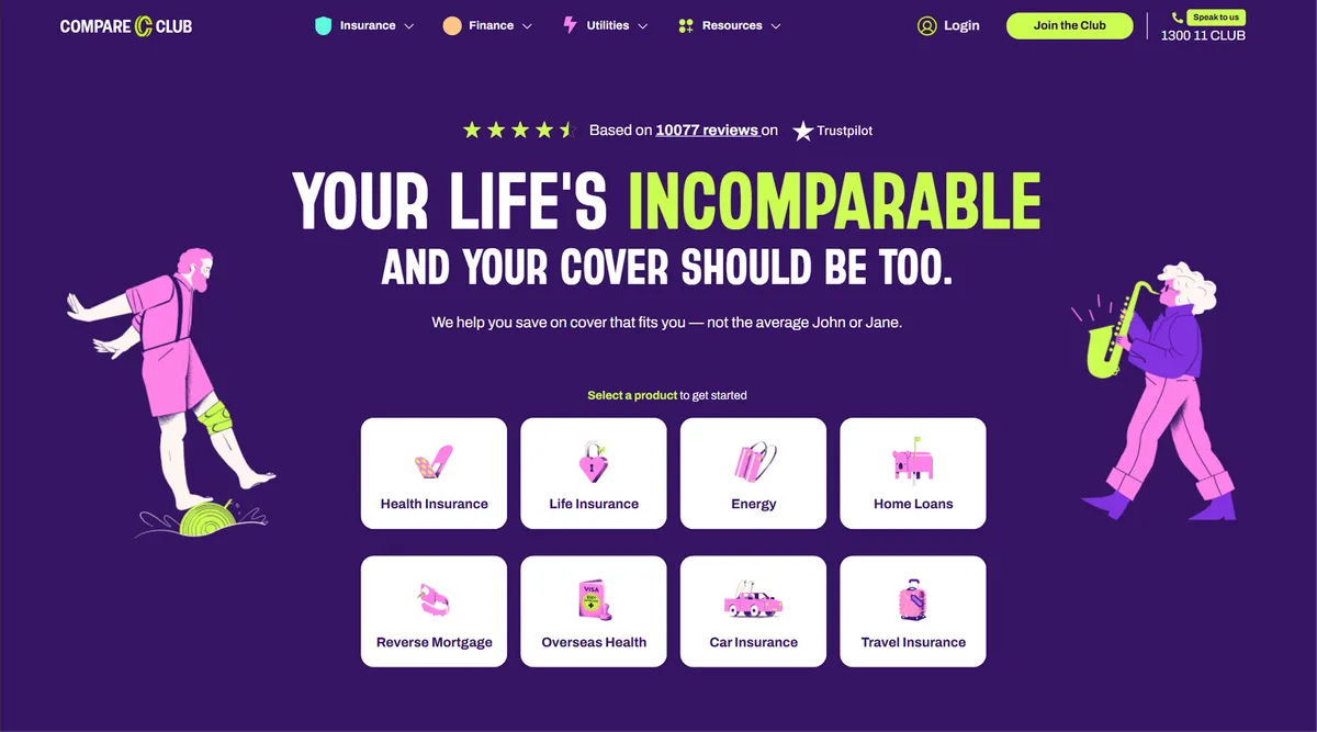
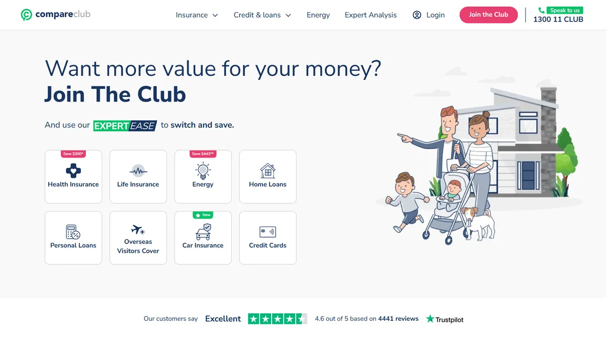
Drag to compare the homepage before and after the rebrand. I was its sole designer, including the dark hero.
- 50-60% faster cross-vertical release timelines post-adoption
- 60+ components shipped across web and mobile in Storybook
- 3 product verticals unified under one governed system
A design system, due the day the rebrand launched
Compare Club is a financial comparison platform operating across Insurance, Finance, and Utilities, three product verticals, each with its own product teams.
The company was refreshing its brand to lift trust and conversion and make the business more valuable. I was contracted as Senior Product Designer to lead the design, build, and implementation of a company-wide design system to carry that rebrand: design tokens, component library, Figma governance, and developer handoff, all ready for a fixed August 2025 launch.
I was one of two designers on the system, in a design team of six, and its lead designer: I owned the UI and set how every component looked and behaved. I also led the rebrand of the EDMs, landing pages, and every other major page, and was the sole designer of the new homepage.
I worked in 2-week sprints inside a core team of 12 spanning brand, marketing, product, engineering, and QA, with the CPO and CMO holding sign-off. The front end was built on Vue.js and Nuxt.js, and the system had to serve around six product teams plus marketing.
6 button styles, and a rebrand that would land unevenly
When I started, there were 6 different button styles across the product:
Four heading variations. Colours and spacing hardcoded directly into components rather than managed through tokens.
Customers felt this at the moment of decision. The same “Compare” action looked different from page to page, and some variants failed WCAG contrast. On a site asking people to trust it with their insurance, finance, and energy choices, an interface that doesn’t look like one product works against the trust the rebrand was meant to build.
The business felt it in delivery. Each team had solved the same UI problems independently, so every new page meant renegotiating decisions that should already have been settled, and a page took 1-2 weeks to get from design through development and QA. For a comparison business, growth comes from testing and improving the pages customers convert on, so slow pages meant slow experiments.
With three verticals shipping simultaneously against a fixed date, the fragmentation was also a delivery risk: unless everyone built from the same foundation, the rebrand would land differently in each one.
| Default | Hover | Active | Focus | Disabled | |
|---|---|---|---|---|---|
| V1: Solid blue; hover darkens to navy. | |||||
| V2: Solid blue, rounder corners; hover turns green and grows. | |||||
| V3: Darker blue, square corners; hover lightens and underlines. | |||||
| V4: Blue outline; hover fills blue with black text. | |||||
| V5: Blue gradient pill; hover fades to 65% opacity. | |||||
| V6: Small uppercase text; hover turns green and widens the letter spacing. |
Audit first: fix what’s frequent and inconsistent
I audited before designing anything. I catalogued the existing UI estate across all three verticals, mapping every distinct pattern, how frequently it appeared, and where the inconsistency was worst.
Prioritisation matrix
Component inventory across 24 screens and 8 products across 3 verticals
That became the prioritisation matrix: high frequency plus high inconsistency meant fix first.
One button, rebuilt from the brand
Rather than pick a winner from the six, I rebuilt the button from the new brand guidelines, and did the same for every component after it. The design team worked through dozens of directions for the homepage and the components internally before we shared anything outside the team, and most of them were dropped along the way.
Colour Tokens
14 semantic tokens defined
Type Scale
1 typeface · 4 weights
Spacing Scale
4pt grid · 6 scale steps
My input went beyond the product UI. I sat in on meetings between the brand and marketing teams and their external agencies, advising on accessibility, the logo, colours, and fonts, and the SEO implications of the changes.
That included pushing back on the brand’s primary typeface. It had no lowercase characters, and its large file size would slow page loads. We agreed to limit it to the hero headlines and keep it out of every other section of the page, so the brand kept its signature look without the cost landing on every page.
Holding the line on rebuilt components
Midway through, one of the product managers lost confidence that we could ship in time and wanted to reuse snippets of existing code, even though the design system components were already built. Shipping the new brand on old components would have undermined the point of the rebrand.
The disagreement escalated to the CPO, with my manager, the Head of Design, and the PM putting their cases. My explanation of what reusing old code would cost, backed by the documentation already in the design system, helped carry the decision: the components were built properly.
One switch on launch day
When leadership pulled the system into an earlier production sprint to test it, I engineered a dual-state token architecture: every token carried both an “old” and a “new” brand value, mapped colour-for-colour.
The alternative was a page-by-page migration, and I had to convince the dev team to give it up. My case was risk: with both brand values already defined in the tokens, the whole estate could switch in a single move on launch day, instead of running two brands side by side for weeks. That turned a schedule shock into a de-risked cutover.
Show, don’t argue
For the homepage hero, I proposed a dark background. The CRO preferred light. Rather than debate the pros and cons, I designed the light version properly and presented it alongside the dark one, knowing it would cost time. Once he saw both, he agreed the dark version was stronger, and that’s the one that shipped.
Letting the work make the case was faster than any argument I could have made.
Owning the system when design leadership left
Partway through the project, my manager, the Head of Design, was made redundant. With no design lead above me, I took ownership of the system and its decisions through to launch.
I designed the propose/review/merge governance model for new components. Adoption took time. Designers outside the system team would take components from Figma, detach them, and change them to make something unique, which meant developers had to recode them and defeated the point of the system. That escalated before the teams aligned on the process. To make the right path the easy one, we also built page templates with bleeds, margins, padding, and base cards ready to build on.
With engineering, I ran weekly open component reviews, paired with developers on implementation, and used Token Studio for token management so the Figma-to-code handoff was as frictionless as possible.
“Sudhi’s creativeness and strategic mindset kept the team energized under tight deadlines. He seamlessly balanced big-picture thinking with meticulous attention to detail—whether crafting brand guidelines, or guiding the other designers on how to adapt the new design system.”
Pages live in days, not weeks
The rebrand launched on schedule across all three verticals. The entire UI moved onto the system, keeping only the conventions that didn’t need to change, and every rebrand page met WCAG 2.1 AA.
The real test came straight after. Engineering needed three new pages designed, built, and live as soon as possible. The tech lead’s estimate: pages like these used to take 1-2 weeks from design through development and QA. On the system, they went live within a few days, which is where the 50-60% cut in release timelines comes from.
Standardised components also cut redundant QA work, taking A/B test deployment from five days down to 48-72 hours. Getting a test live in roughly half the time means more tests on the pages customers convert on.
Designers stopped building one-off UI and had a library of 60+ components, shipped in Storybook, to build and test on. The GM of Marketing, the CPO, and the Head of Customer Experience, who took ownership of the system after the project, all praised the work.
“Sudhi played a key role in our rebranding work by helping migrate the design system, staying on top of requests, managing stakeholders, and keeping the work ticking without drama. The result was a smoother rebrand rollout, faster design/dev collaboration, and happier stakeholders.”
What I’d do differently
Dev working sessions should have happened in Sprint 1, not Sprint 4. We refactored token names after implementation, which was entirely avoidable if engineering had shaped the naming conventions from the start.
I’d also invest more in governance. The system was consistent the day my contract ended, but a year on, small inconsistencies and one-off changes have crept back in. With more time I’d have built component variants for more use cases, so teams had less reason to detach, and embedded the governance process more deeply before handing it over.